DM House | Guilherme Torres
Generally speaking, we know what colors we’re attracted to. However, we’re often more certain of the colors that we dislike. The reason for this varies, as our tastes have been shaped through our life experiences, culture, and the influences around us. Most of us have different opinions about colors and how they make us feel. This is why it is important to understand a little bit of color psychology and how it ties to interior design.
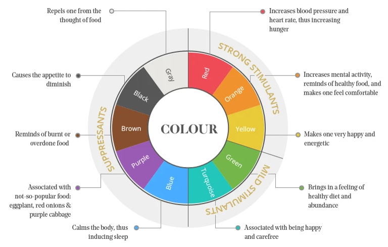
Color Psychology
Color psychology is a very interesting field that studies the affect that colors have on a person’s behavior and well-being. Therefore, the use of color psychology in interior design is extremely important because the choice of a color in a room may affect people’s behavior, mood, and impression on others.
According to research, colors can even change our heart rate, blood pressure, and respiration. They can affect our moods and the way other people respond to us. For example, red enhances human metabolism, increases respiration rate, and raises blood pressure. On the other hand, green slows human metabolism and produces a calming effect.
Choosing a color palette just to follow trends and copy what you see on TV, in magazines, or on social media could end up in a failed attempt, as the color selected could work against the feeling you want your space to convey.
Source: Industville (The Psychology of Restaurant Interior Design)
Because of this, when it comes to choosing a color for a space, there are questions that we should ask first. For example:
- What is the purpose of this room?
- Is it a space for conversation and engaging activities?
- Is it a space for rest and relaxation?
- Do I need to keep focused and concentrated in this space?
- Is it a place for distraction and leisure?
Specific Colors & Our Emotions
When you have these answers defined, you can proceed more confidently to select the right color palette for your space.
Let’s take a look at some different colors and how they can affect the mood in a space:
Red
Red attracts the most attention and is associated with strong emotions such as love, passion, and anger. The color red increases our appetite. As a result, it is very commonly used in spaces like restaurants, cafes, and bars. I would recommend accents of this color in the kitchen area like a decorative center piece or wall art.
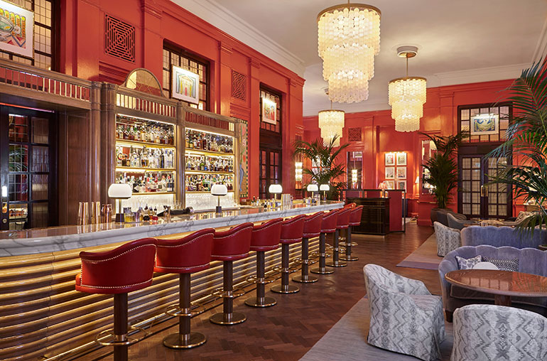
The Coral Room Bar at London’s iconic Bloomsbury Hotel | Photography courtesy of the Bloomsbury Hotel.
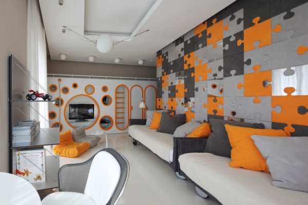
Orange
Orange is the color of encouragement, optimism, and self-confidence, marking the extrovert. Playgrounds and game rooms for children are enhanced by the color orange. It is also great in teenagers’ bedrooms.
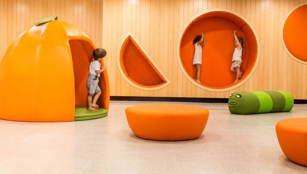
Photo by Dudi Moskovitz via Design-milk
Lushome.com
Yellow
Yellow is the color of the mind and the intellect, resonating with the left logical side of the brain. It is creative, the tone of new ideas and new ways of doing things. Mostly seen as a summertime color, it makes porches, living rooms, kitchenettes, terraces, and patios so bright, fresh, and inviting.
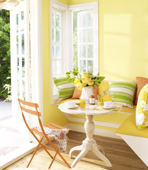
Source: Country Living Magazine
Green
Green is the color that connects us with nature, expressing the concept of balance and growth. It is restful and secure, symbolizing harmony, healing, and stability. Green is a great color for any space. It is perfect for bedrooms, living rooms and spaces where you need a calming atmosphere.
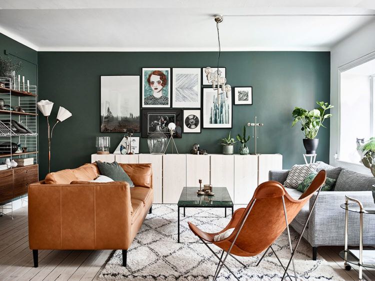
Styling: Alexandra Ydholm | Photo: Andrea Papini
Blue
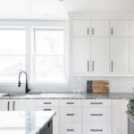
Blue is the color of trust, serenity, and peace. This color can be used anywhere. The different tones can add a soothing touch as well as it can make a bold statement in any room. Kitchens look very distinctive with blue cabinetry.
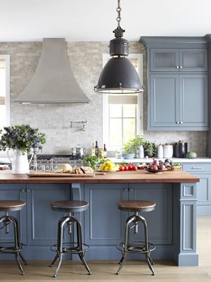
Source: House Beautiful
Purple
Purple is the color of imagination and spirituality, inspiring high ideals. As a color well used in royalty, it implies wealth and elegance. It will enhance any room, but it is better to use it sparingly in your interior.
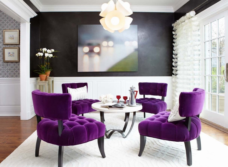
Last Detail Interior Design
Colors and emotions are very intertwined. Warm colors (red, orange, and yellow) can evoke different emotions than cool colors (green, blue, and purple), and bright colors can create different feelings than muted colors.
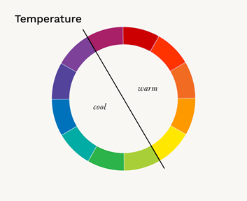
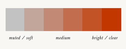
Source: theconceptwardrobe.com
A color can influence us to make us feel happy or sad, and they can make us feel hungry or relaxed. Therefore, it is important to understand the psychological effects colors might have on a regular person as well as the fundamentals of color theory and the meanings of colors.
Where to Start?
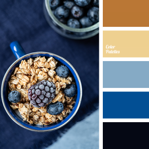
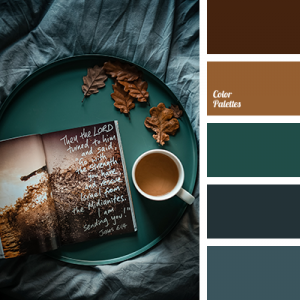
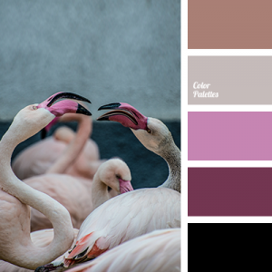
Putting together a color palette that evokes everything you want can be intimidating. A good starting point is searching for pre-made palettes. You can find numerous color palette ideas on websites like colorpalettes.net. Check these ones out:
Now that we have seen how different colors can evoke different moods in us and how they can be used wisely in every space, I will keep sharing in the next posts about each color in detail, in their different tones. We can all create the feeling that we want in our special place and make our rooms come to life to reflect ourselves in our own personal COLOR MOODS.
If you would like to learn more about color palettes or how we can help you choose the perfect color for your space, you can contact us here to schedule a consultation. If you’d like to see more from us, check out our portfolio, other blog posts, and our social media pages!
![]()
![]()
![]()
![]()