
“If time were a color, I bet it would be a tasteful off white.”
Greg Parrish, American Golden Age Illustrator, 1870-1966
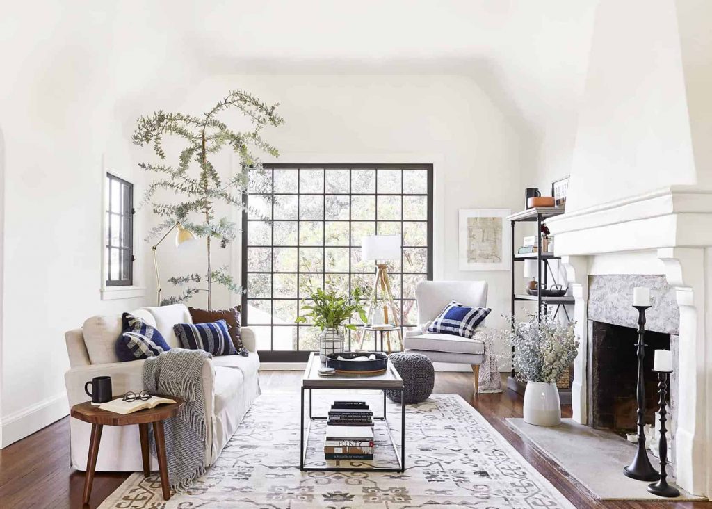
Interior Design by Emily Henderson
Are you the type of person that thinks white goes with everything?
If so, you are not far from the truth. Most people see it as a safe and easy selection when it comes to interior decoration. From furniture, linen and accessories to the walls and ceilings; you can never go wrong with white! Right?
The reason for this is simple, the color white is a combination of all colors within the color spectrum. In other words, it is a color that contains all the colors (or reflection of them) at the same time. This is perceived as a pleasant combination by our eyes.
Interpretations of White
In Western cultures, white is often associated with perfection, purity and innocence. A blank canvas, it symbolizes new beginnings and a fresh start. On the other hand, in Eastern cultures, white is widely associated with death and mourning. The Taj Mahal is a great example of this.

The Taj Mahal, a symbol of love and power, looks majestic in white marble | Image by Michael Turtle
What Shade of White?
Given its simplicity, white can be extremely calming and works well in the creation of light and airy interior schemes.
However, too much white can be seen as empty, cold, impersonal, or sterile – like a doctors white coat.
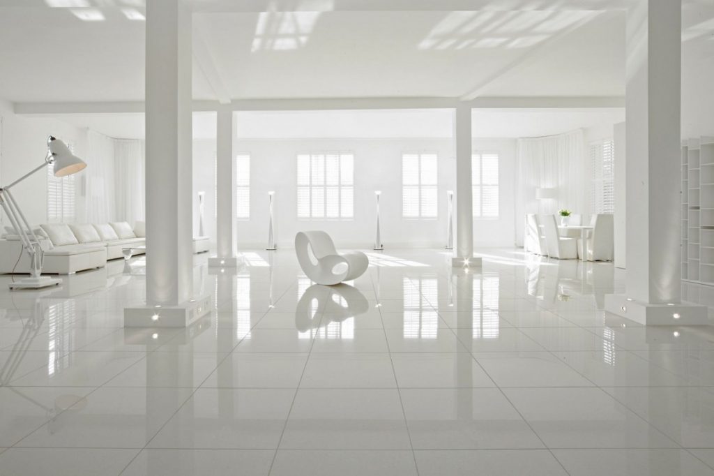
The Zone, a professional location studio in London, England
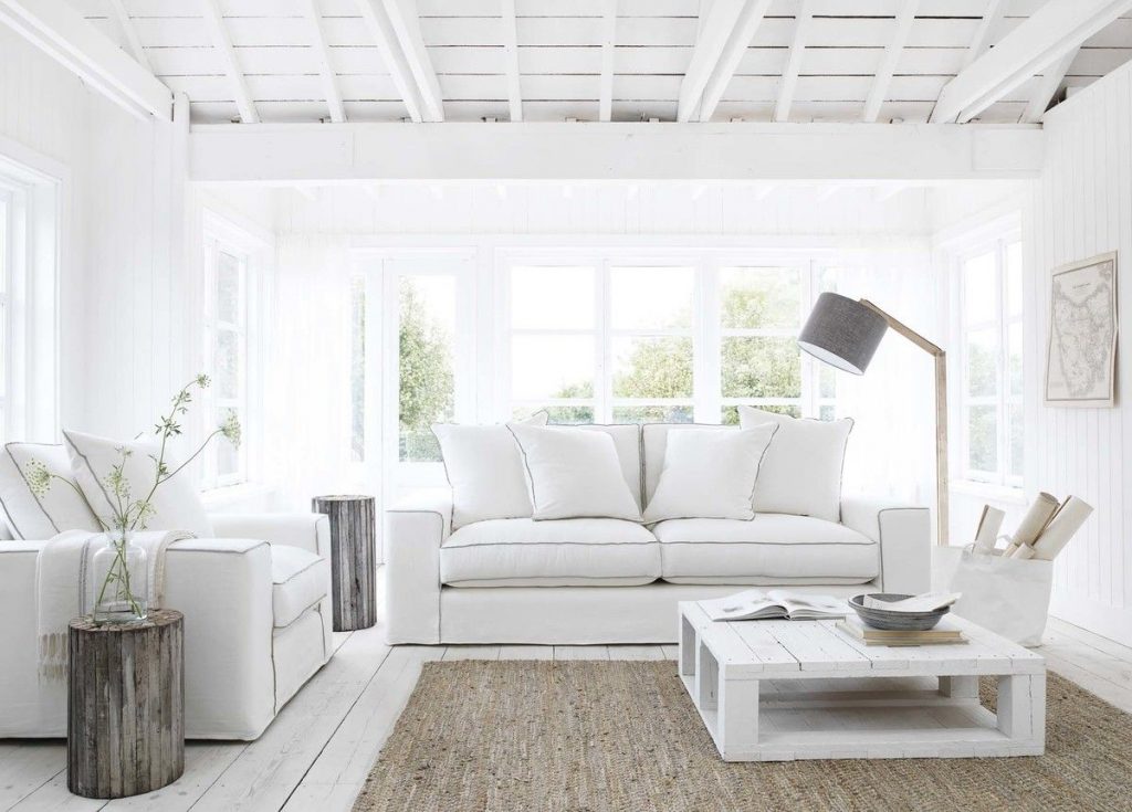
If you are opting for an all-white interior scheme, incorporate a variety of shapes and textures to add warmth and visual interest to your space. A great example of a well done all-white interior is this cozy bedroom, rich in textures and different shades of white.
Interior Design: Monika Hibbs | Photography: Tracey Ayton
Shades of white are tones that differ only slightly from pure white. Variations of white include what are commonly termed off-white colors, which may be considered part of a neutral color scheme. For instance, colors considered “shades of white” include cream, eggshell, ivory, Navajo white, and vanilla.
Warm Whites
First, think about the lighting in your space. Go for a warm shade of white, like White Dove, Snowfall White or Swiss Coffee (all by Benjamin Moore) to balance out any cool light (gray light) of north-facing rooms. As you can see in the image below, the kitchen walls and cabinetry have been painted with Benjamin Moore Swiss Coffee. The addition of this creamy white to an otherwise bright and airy space makes it warm and inviting.
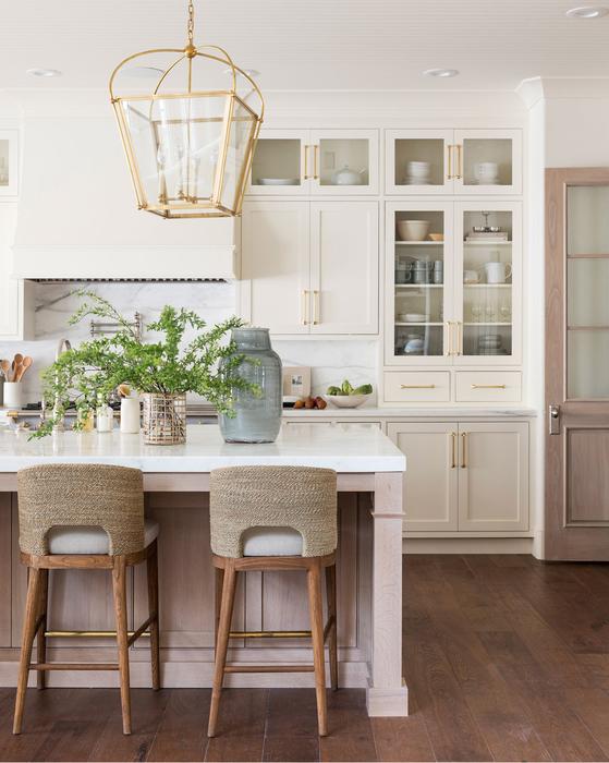
Image Source: Studio McGee
Cool Whites
If your room happens to face south, go for cooler toned white instead. Doing so will balance out the warm light (yellow light) that they receive. Paper White, Super White and Chantilly Lace (all by Benjamin Moore) are all good options. Take a look at this kitchen painted with Benjamin Moore Chantilly Lace. In this situation, the designer needed a white that would make the space bright and clean to counteract the warm light coming in from the south-facing windows.
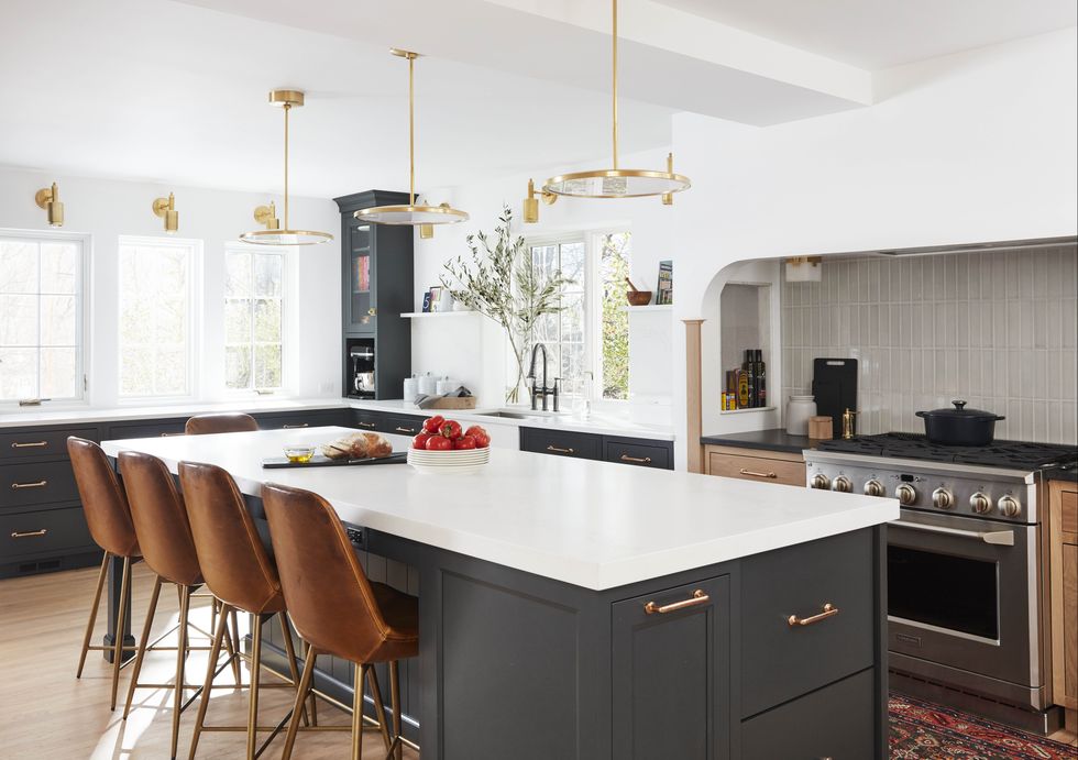
Saltz Home | Interior Design: Jean Stoffer | Photography: David A. Land
Neutral Whites
Certain shades of white can have a yellow or gray undertone, however, neutral whites have no undertone. As a result, this means that they can be used under any circumstance in any room. Simply White by Benjamin Moore and Pure White by Sherwin-Williams are great neutral options.
My go-to neutral white for all projects, no matter what locale, is Benjamin Moore Decorator’s White. I find this shade works very well, no matter what style of space the client is going for. Whether the space is contemporary or traditional, Decorator’s White is bright but still has a good amount of warmth.
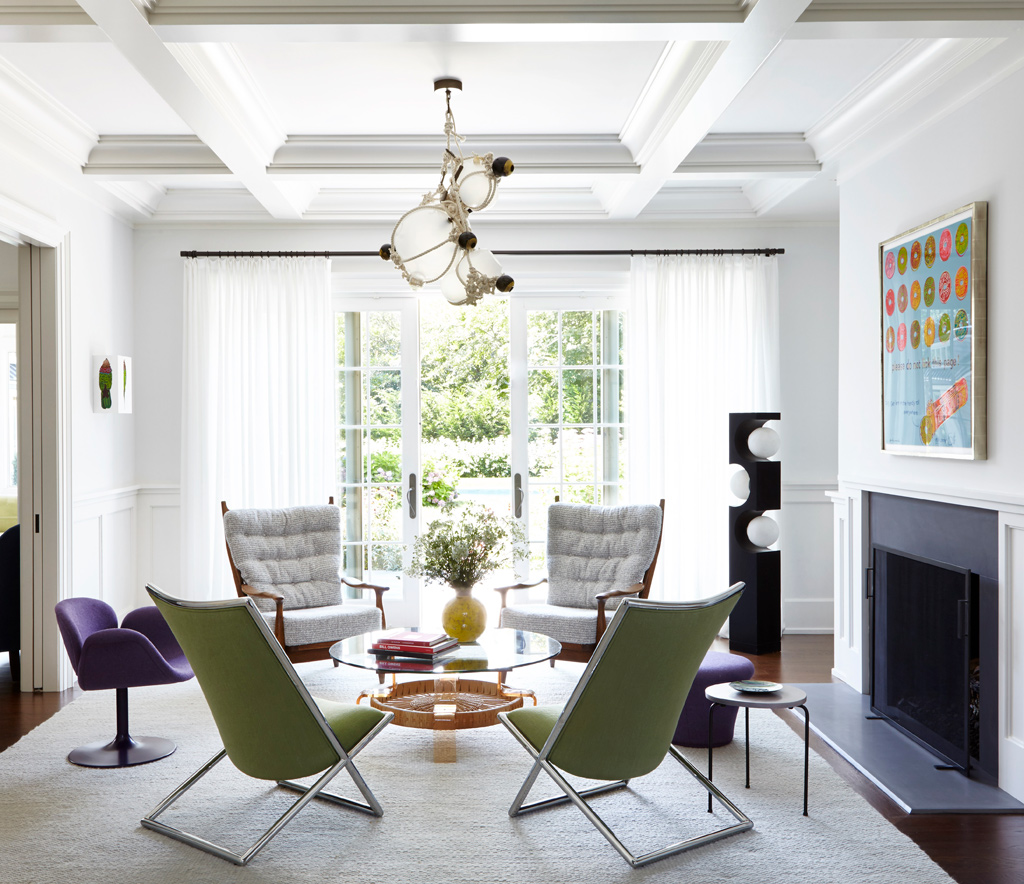
Interior Design: Timothy Brown | Photography: Joshua McHugh
Layering in Other Tones & Textures
As they are not inherently stimulating, white and other neutral tones can work well to complement or offset bolder colors in an interior.
Wondering what other neutrals, colors, and tones work best with the color white? Stay tuned for my next blog post. I will be giving you some tips to help you decide what is best for your space!
If you would like to learn more about how we can help you choose the perfect palette for your space, you can contact us here to schedule a consultation. If you’d like to see more from us, check out our portfolio, other blog posts, and our social media pages!
![]()
![]()
![]()
![]()
Author:

Wendy Ramos
Interior Designer
Distinctive Design Studio


